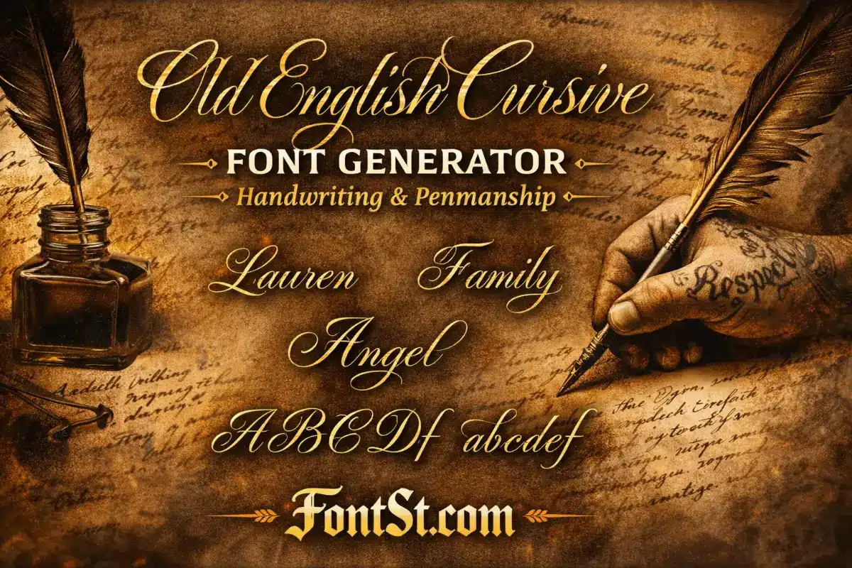
Type your text into FontSt’s generator below to create a smooth Old English cursive font look with a classic handwriting feel. Choose the style you like, then Copy & Paste it for bios, captions, titles, and tattoo mockups.
Old English cursive brings a classic blackletter mood into a smoother, handwriting-like flow—perfect when you want “Old English vibes” without the heavy, sharp density. Use FontSt below to generate an Old English cursive look instantly, then Copy & Paste it into bios, captions, titles, and tattoo mockups.
An old english cursive font is essentially “Old English style” with a softer, more handwritten feel. Traditional Old English (blackletter) is bold, angular, and dense. Cursive Old English keeps the classic mood—heritage, vintage, dramatic—but adds smoother strokes and more readable spacing.
That’s why this style is popular for:
Bios and captions that need readability
Names and short mottos that should look premium
Tattoo concepts where heavy blackletter would look too boxed
Titles that want “classic” without being overly harsh
If you like the Old English vibe but feel the standard blackletter is too intense, cursive is the clean middle ground.
“Old English handwriting” is a keyword people use when they want text that looks like it came from an old journal, certificate, or handwritten title—something vintage, elegant, and crafted.
In practice, Old English handwriting style usually means:
A classic letter mood (historic/heritage)
Slightly slanted or flowing strokes
Softer shapes than strict blackletter
A “written” rhythm rather than sharp, stamped letters
Best Use Cases
Signature-style names
Short quote headings
Invitation-like titles
Aesthetic social text (bio line, highlight name, pinned caption)
Tip: Handwriting styles look best when you keep the phrase short and let the letterforms breathe.
“Old English penmanship” focuses on the technique vibe: clean strokes, consistent spacing, and that “inked” elegance you’d expect from skilled writing.
If you want your text to look like true penmanship (not messy), aim for:
Clear letter spacing (don’t cram words)
Minimal symbols and extra decoration
Short phrases, clean lines
Consistent capitalization (Title Case often looks best)
Penmanship-Style Formatting Ideas
One word per line for emphasis
Two-line layout:
Line 1: Old English cursive title
Line 2: normal text subtitle
This creates contrast and makes your Old English cursive line feel intentional.
If your goal is learning—not just copying a style—the key is practicing the core shapes that define cursive Old English: tall stems, controlled curves, and consistent slant.
A Simple Practice Method (Beginner-Friendly)
Start with slow, large letters (don’t write small at first).
Practice “stems” and “arches” (l, h, n, m shapes).
Repeat the same letter 10–20 times to build muscle memory.
Move to short words (3–5 letters) before long phrases.
Keep spacing consistent—cursive Old English looks bad when it’s cramped.
Letters That Usually Need Extra Practice
M, N, W (they crowd easily)
S, R (curves + structure must stay clean)
G, Y (tails can get messy)
Even if you’re learning to write it, FontSt can help: generate a word you like, then use it as a reference for practicing the shapes.
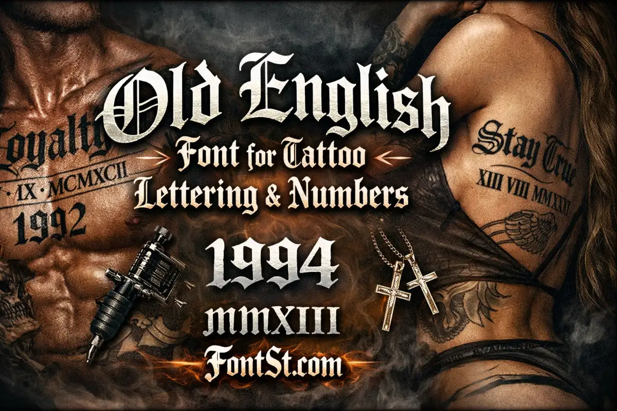
The cursive old english alphabet is popular for initials, monograms, and letter-by-letter tattoo planning. A single Old English cursive letter can look more premium than a full sentence—especially for logos and personal marks.
Best Ways To Use The Alphabet
One-letter initial (A, M, R, S, L)
Two-letter monogram (A&M, J.K)
Small set of initials (2–4 letters)
Hidden initials under a short motto
Quick Alphabet Workflow With FontSt
Generate one letter (uppercase and lowercase).
Copy it into Notes.
Compare which form looks cleaner.
Repeat for your full set of initials.
Tip: Some letters look better in uppercase for Old English styles. Always test both cases.
An old fashioned handwriting alphabet usually means vintage handwriting—clean, classic, and readable—rather than the sharp “medieval” density of heavy blackletter.
Old English cursive often sits right in that sweet spot:
It has the heritage feel
It still reads clearly on modern screens
It looks “crafted” instead of purely decorative
When Old-Fashioned Handwriting Is The Better Choice
Smaller text (bios, captions)
Longer names
Two-line titles (headline + subtitle)
Anything meant to be read quickly at a glance
If you want the old mood but don’t want a harsh gothic vibe, this is the direction to choose.
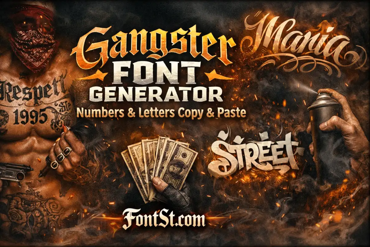
A gangster old english cursive font keeps the Old English mood but leans more “street”—often used for tattoo name concepts, bold titles, and statement words that feel confident but still readable.
Where This Style Works Best
Tattoo names and short mottos
Social bios with a strong identity vibe
Titles and cover text when blackletter feels too harsh
If you want the classic gangster vibe but hate how dense regular Old English can get, this cursive direction is usually the best upgrade.
Old English cursive is the perfect middle ground between classic blackletter and modern handwriting—vintage, elegant, and much easier to read. Use FontSt to generate Old English cursive text instantly, then Copy & Paste for bios, captions, titles, tattoo ideas, and alphabet initials. Keep it short, keep it clean, and always preview at real size when you’re planning a tattoo.