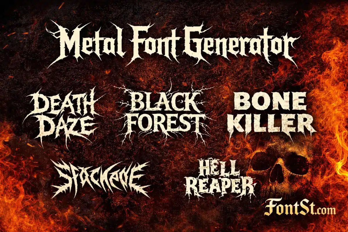
Metal typography is all about sharp energy—spikes, razor edges, and aggressive rhythm that instantly feels like a band logo. Use FontSt below to generate heavy metal–style text fast, then Copy & Paste it for titles, bios, posters, thumbnails, and mockups.
A metal typography font is a style of lettering inspired by metal music culture—especially band logos and album titles. It usually features dramatic shapes: sharp points, aggressive strokes, high contrast, and sometimes symmetrical or “branching” details that look intense even when the word is short.
Metal typography is popular because it communicates a vibe instantly:
Aggressive / loud / powerful
Dark / intense / dramatic
Band-like identity for usernames, posters, covers, and titles
The key is balance: the text should look fierce, but it still needs to be recognizable—especially on small screens.
Metal lettering isn’t just one style. There are multiple types of metal typeface font looks, each with its own personality. Here’s a simple way to think about them:
Spiky / razor fonts: sharp edges, speed, high aggression
Gothic / blackletter metal: classic heavy vibe, readable bold structure
Distorted / horror metal: broken strokes, rough texture, chaotic energy
Minimal heavy metal: thick weight, clean shapes, modern poster feel
When choosing a style, match it to your use:
Band logo mockup: go spiky/runic/distorted
Poster title: heavy weight + readable shapes
Bio/caption: cleaner metal style that stays legible small
Death Metal Font
A death metal font usually pushes intensity to the max—sharp, jagged forms with dense detail. It can look amazing as a logo, but it can also become unreadable if you use long phrases.
Best for:
1–2 words (band-name style)
Short titles and thumbnails
Cover-style text
Keep it readable:
Use fewer words
Add spacing if characters feel crowded
Avoid tiny sizes (details can collapse)
If your phrase is more than 10–12 characters, consider a cleaner metal style instead of the most extreme death-metal look.
A heavy metal font is often the most versatile category: bold, powerful, and still fairly readable. It’s the best option when you want metal energy without sacrificing clarity.
Best for:
YouTube/short video titles
Poster headings
Bios and display names
Merch mockups and banner text
Quick formatting tips:
Title Case tends to look cleaner than ALL CAPS in many metal styles
Keep a strong two-line layout for longer titles
Use simple punctuation (dash, dot) instead of clutter
A black metal font is usually more atmospheric: thin-to-sharp forms, branchy or thorn-like extensions, and a mysterious, dark aesthetic. This style looks incredible as a logo but is often less readable by design.
Best for:
Logo mockups (1 word)
Art headers and cover text
Dark aesthetic titles
How to use it without losing people:
Use it as the “main word” only
Put the subtitle in a simple readable font
Don’t use long sentences in black-metal style
A clean layout trick:
Line 1 (black metal): main word
Line 2 (normal text): details
Metal Music Font
A metal music font is a broader phrase people use when they want “something that looks like a metal band.” That could be heavy, death, black, gothic, or even horror-styled lettering.
If you want a safe, widely usable metal music look:
Metal font copy and paste is the fastest way to use the style across platforms without installing font files. That’s why Font St works well for quick branding and social content.
Best places to paste metal text:
Instagram/TikTok bios
YouTube titles and thumbnails (as mockup text)
Discord names and server channels
Posters, banners, and design drafts
Copy & Paste tips:
Some apps render special characters slightly differently
If the output looks broken, choose a simpler style
“Death note fonts” is a common search phrase people use for spooky, dramatic typography inspired by dark anime aesthetics. In practice, users usually want:
eerie serif vibes
sharp dramatic strokes
horror-style text energy
Best for:
spooky captions
themed titles
aesthetic edits
character quote cards
If you’re building a “Death Note” vibe, keep the phrase short and let the typography be the headline—don’t add too many extra effects on top.
What is the best metal font for readable titles? A heavy metal style with bold strokes and simpler shapes is usually best. Save the most extreme death/black styles for short headline words.
Why does metal text sometimes look messy when I paste it? Some stylized characters render differently across apps and devices. If it looks broken, choose a simpler output or reduce the length.
Can I use metal fonts for usernames? Sometimes. Many platforms restrict special characters in usernames/handles. If it won’t work for the handle, use it in the bio or display name instead.
How do I make a metal band name look like a logo? Keep it short, prioritize a strong silhouette, and use a two-line layout for longer names (main word in metal style, subtitle in normal text).
What’s the difference between heavy, death, and black metal fonts? Heavy metal fonts are more readable and versatile, death metal fonts are more aggressive and detailed, and black metal fonts are often atmospheric and intentionally hard to read.
Do I need to download a font file to use this? No—FontSt is designed for quick copy & paste text styling. For professional design work that requires font files, you’d typically use licensed fonts in design software.