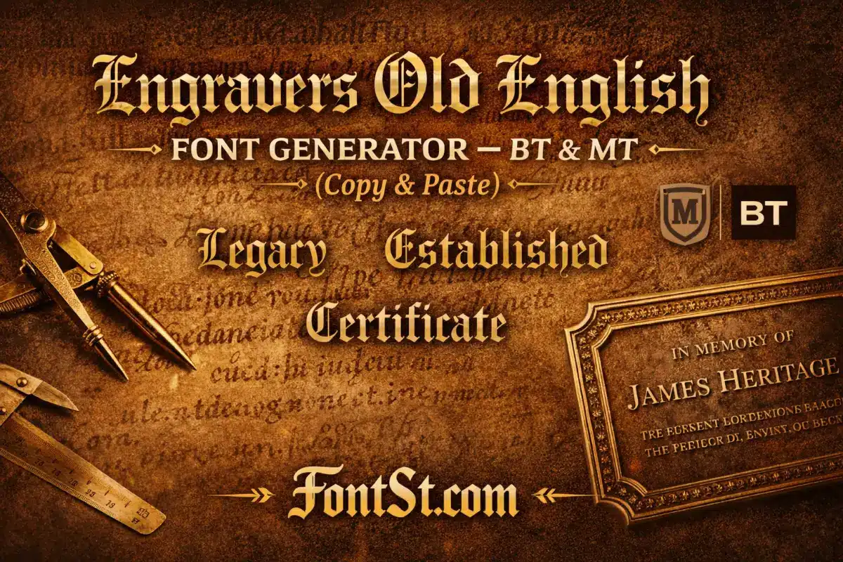
Create a classic Engravers Old English Font look (BT & MT vibe) in seconds with FontSt’s generator below. Type your text, choose the cleanest engraved-style result, then Copy & Paste it for titles, logo drafts, plaques, and carving mockups.
Engravers-style lettering is a go-to for classic certificates, premium logos, and carved/engraved name designs. Use Font St below to generate an Engravers Old English look (BT & MT vibe), then Copy & Paste it anywhere for titles, mockups, and quick layout tests.
What is an engravers font? It’s a lettering style designed to feel “cut” into a surface—think metal plates, certificates, trophies, and formal signage. Engravers fonts usually have crisp structure, sharp terminals, and a clean rhythm that holds up well when converted into outlines for printing, engraving, or laser work.
People choose engravers styles because they communicate:
Authority (official, traditional, premium)
Legibility (clear forms, stable spacing)
Craft (looks intentional on physical materials)
Engravers Old English is a special case: it blends the “engraved” mood with Old English/blackletter heritage, so the result feels classic and decorative without going full medieval.
The engravers old english font generator on this page is built for fast results: type your text, generate the BT/MT-style look, then copy it in one click.
Best Uses For Engravers Old English
Certificate-style titles and headings
Vintage logo drafts and badge text
Display names (short phrases) for posters and banners
Mockups for engraving, trophies, plaques, and signage
Quick Formatting Ideas
One strong line: “Certificate Of Merit”
Two-line layout: top line in Engravers Old English, bottom line in plain text for clarity
Initials: a single letter or monogram can look more premium than a full sentence
If your phrase feels heavy, shorten it or split it into two lines—Engravers Old English looks best when it has breathing room.
Engravers Old English BT Font Copy And Paste
Many users specifically search engravers old english bt font copy and paste because they want the familiar “BT” look but without installing anything. Copy & Paste styling is perfect for:
Social titles and captions
Drafting logo text quickly
Naming highlights, series titles, or thumbnails
Testing words before you commit to a final design
Copy & Paste Tips For A Cleaner Look
Keep it short: 1–8 words works best
Avoid extra symbols inside the word (put icons at the end)
Add spacing for long names (especially letter pairs like M/W/N)
Test on mobile before publishing
If you’re planning to engrave or print, treat Copy & Paste as the “draft stage.” Once you love the wording, you can recreate it in a proper design file.
The keyword monotype engravers font is often used when people mean the “MT” version they’ve seen in font menus. In everyday use, “BT vs MT” is less about what you should pick and more about what you’re trying to match:
Want a look that matches a BT-labeled reference? Aim for the cleaner, classic Engravers Old English vibe.
Want a look that matches an MT-labeled reference? Go for a similar engravers style with stable spacing and strong structure.
The phrase engravers gothic font usually refers to a more architectural, sharply-structured style—less decorative than Old English, but still premium and carved-looking. Think of clean, authoritative lettering used on plaques, nameplates, and signage.
When “Engravers Gothic” Is Better Than Old English
You need maximum readability at small sizes
Your design is modern-minimal but still “official”
You’re engraving thin materials where decorative details might fill in
If your project is physical (wood, acrylic, metal), gothic engravers styles are often safer for small sizes because they keep inner shapes open and clear.
A good laser cutter font must survive conversion to outlines and still cut cleanly. Engravers styles are popular here because their structure can look premium on wood, acrylic, leather, and coated metal—if you keep a few rules in mind.
Laser-Cutting Rules That Matter
Avoid ultra-thin hairlines (they can burn away or break)
Don’t go too small: details fill in at tiny sizes
Increase spacing for tight blackletter shapes
Convert text to outlines before cutting (in your design software)
Best practice: do a small test cut with your chosen word before a full run. One test can save a project.
Carving Font
A reliable carving font is one that stays readable after the material removes detail. Engravers styles can look amazing carved, but they need the right setup.
Carving-Friendly Settings
Use bold, clear strokes (avoid overly delicate details)
Increase letter spacing slightly
Prefer shorter words or split long text into two lines
Keep inner counters open (like inside “O”, “A”, “R”)
If your Engravers Old English result looks too dense, choose a cleaner variation or simplify the phrase. Carving rewards simplicity.
Best Font For Wood Carving
The best font for wood carving is the one that holds its shape when wood grain, tool width, and depth come into play. Engravers-inspired lettering works well because it looks “crafted” by default.
What Works Best On Wood
Medium-to-bold weight
Larger size for decorative styles
Short phrases (wood carving loves strong, simple words)
Two-line layouts instead of long single lines
Quick Wood-Carving Checklist
Can you read it from 1–2 meters away?
Do small inner details disappear when scaled down?
Does the word have enough spacing between letters?
If any answer is “no,” increase size or simplify the style.
Stone Carved Font Free
People search stone carved font free because they want a carved-stone look without complicated setup. For stone engraving, the biggest challenge is detail: stone doesn’t forgive tiny flourishes.
For Stone, Prioritize:
Simpler letterforms
Strong contrast and open counters
Generous spacing
Short, meaningful text
If you’re doing stone carving, use the generator to draft your words quickly, then hand the concept to your engraver or designer to adjust for depth and legibility.
An engravers roman font is the classic pairing for “official” engraving—clean Roman letterforms that feel timeless and readable. It’s often used when you want the engraved look without the decorative Old English mood.
When Engravers Roman Is The Better Choice
Nameplates and professional signage
Awards, trophies, plaques
Long names or multi-line text
Anything that must remain readable at smaller sizes
A strong combo for premium designs:
Title in Engravers Old English (short)
Details in Engravers Roman (clean, readable)
This gives you personality on top and clarity below.
Add spacing for dense styles (especially Old English shapes)
Test at the real physical size if engraving/cutting/carving
Use two-line layouts for longer text
Treat Copy & Paste as your fast draft—then refine spacing for the final output
If you want, send me your planned use case (laser cut wood sign, metal plate, acrylic, tattoo, or social title) and the exact phrase—you’ll get a tighter recommendation on style, spacing, and the cleanest layout.